This time of year calls for bursts of red, pops of white, and in the stationery world, it’s all about the blooms too! We pulled a few of our favorite customizations that reminded us of the approaching holiday and yet still incorporates the beautiful botanicals we’ve been seeing throughout the shop. Take a peek below to see what we’ve found:
Do you find yourself attracted to a more old-fashioned, vintage vibe? This timeless stationery below features a gorgeous red floral adorning the cards with traditional fonts surrounding the botanical imagery. There’s something about the combination of crisp black letterpress type and bright red that we can’t ever get enough of.
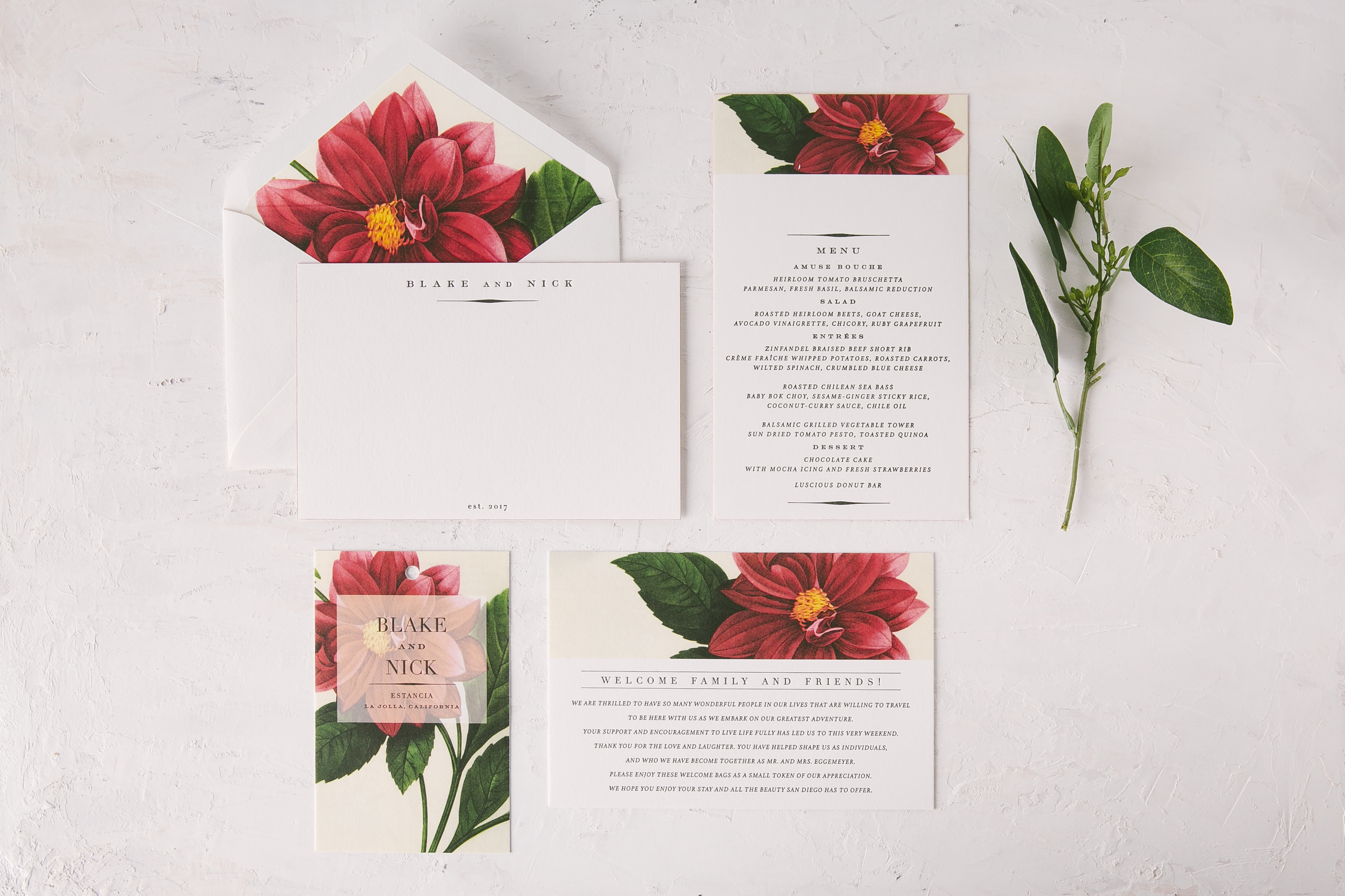
 Letterpress color: Black | Fonts: Copperlove + Capital + Didot | Design: Exeter | Paper: 1 ply Smooth Cotton | Customization: 40164 | The Stationery Company
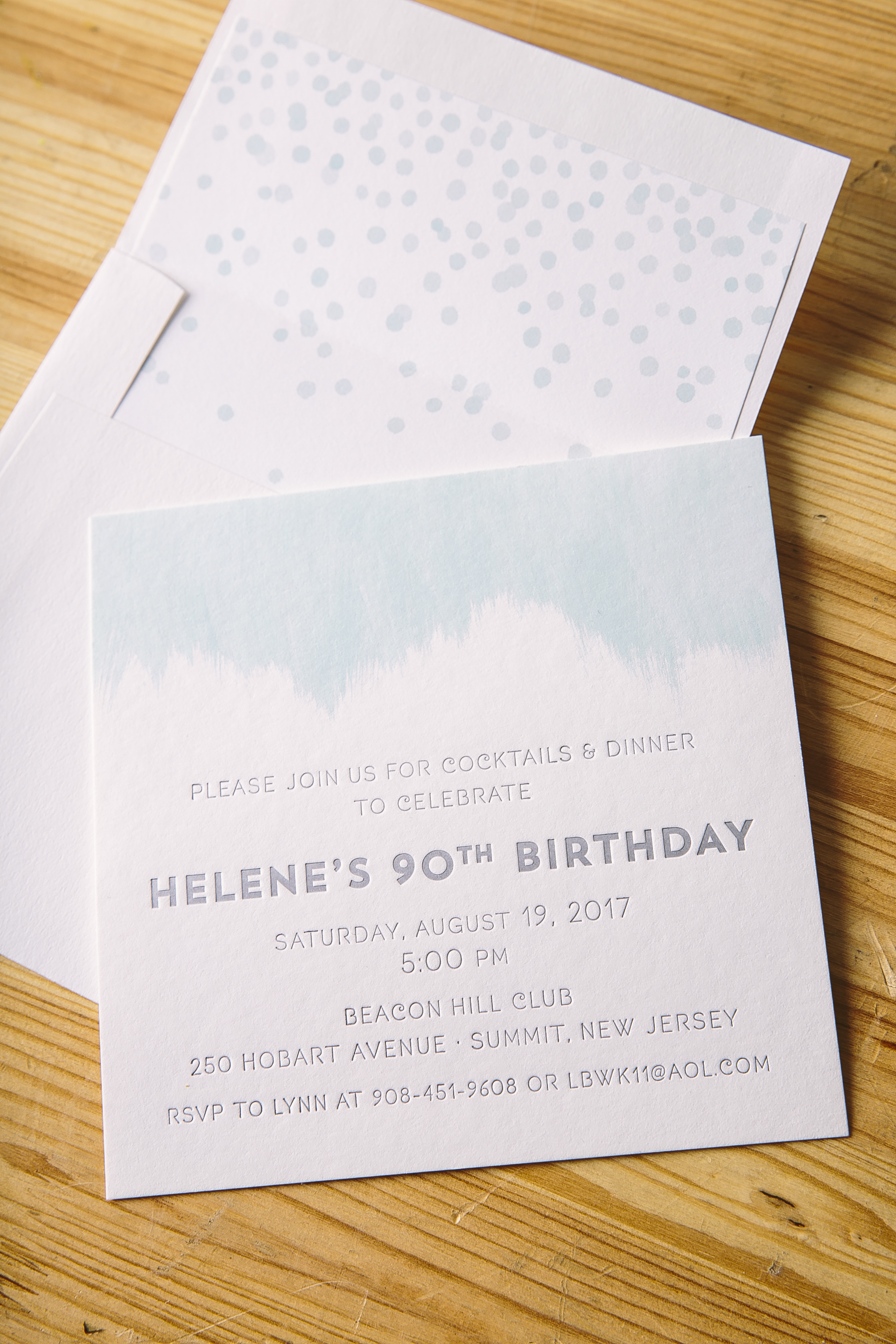
Searching for an invitation that’s equally as down to earth as your relationship? Look no further! This customization printed in our Pewter and Cardinal letterpress inks set the tone for a more casual affair in the summer months, while still adding a touch of elegance with the addition of a floral print envelope liner.

 Letterpress colors: Pewter + Cardinal | Fonts: Harriet + Nave + Nave Inline | Design: Prescott | Paper: 1 ply Smooth Cotton | Customization: 37125 | Papel New York
If it’s a pop of color that pulls on your heartstrings most, the customization below is calling your name. Our eye-catching Azure letterpress ink is the perfect fit for a wedding with a touch of modern flair. The contrasting patterns found on the border of the invitation, as well as envelope liner, play off each other perfectly.

 Letterpress color: Azure | Fonts: Harriet + Nave + Nave Inline | Design: Prescott | Paper: 2 ply Smooth Cotton, 1 ply Smooth Cotton | Customization: 37567 | Petite Paperie
Marique and Derek’s were married this past January at the Willowdale Estate in Topsfield, Massachusetts. Their
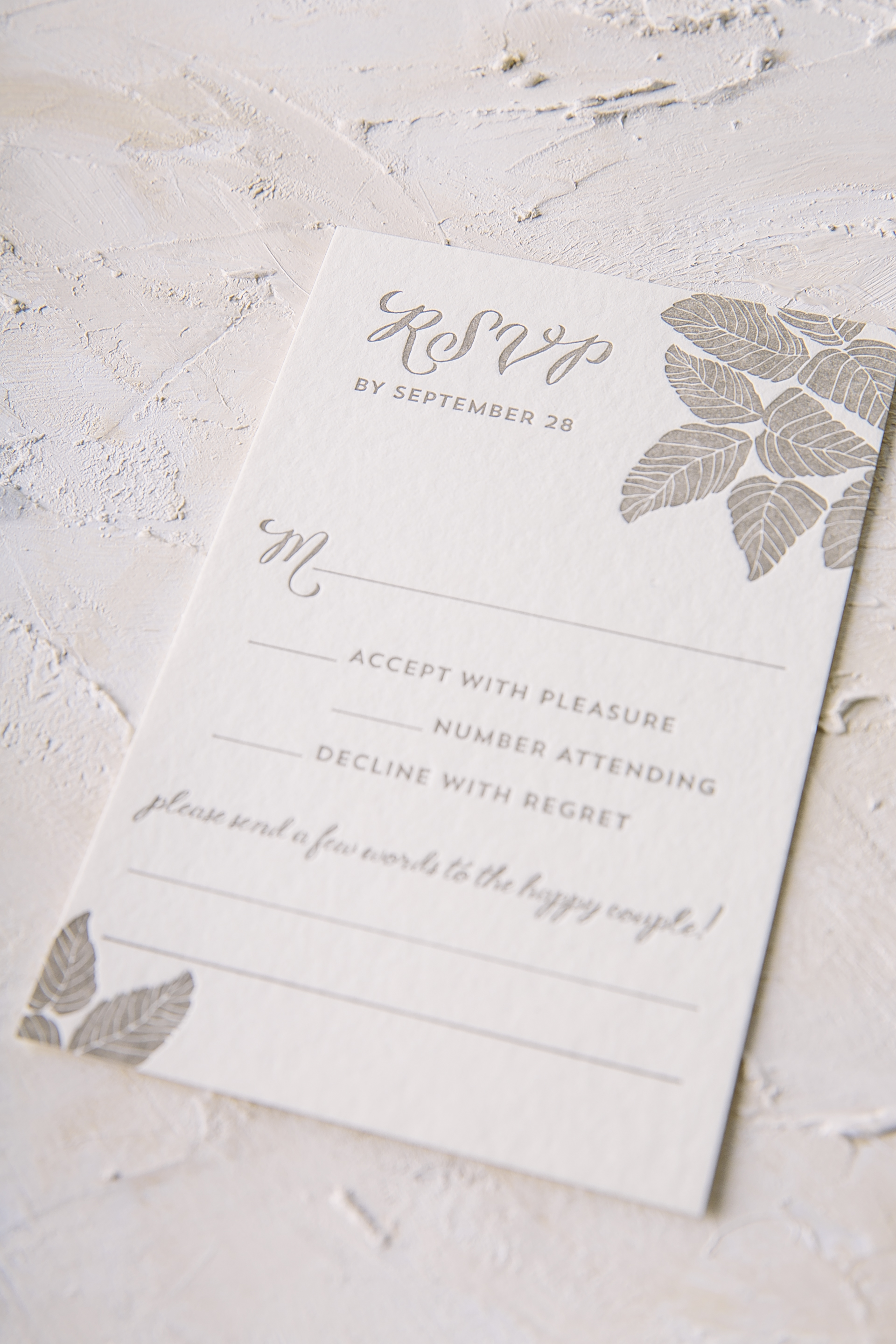
botanical foil stamped wedding invitations reflected the aesthetic of their venue beautifully. A plum letterpress border and a thin tawny matte border added a subtle touch of color yet still complimented the custom pattern scattered within the suite. This Haynes set included a coordinating reply card, rehearsal dinner card and accommodations card, all carrying botanical motifs throughout – including the envelope liner as to wrap everything up. This stunning suite wouldn’t have been possible without the help of our friends at Gus and Ruby!


Foil color: Tawny Matte | Letterpress color: Plum | Fonts: Plaza Script, Social and Carrington | Design: Haynes | Paper: 2 ply Bamboo, 1 ply Bamboo | Size: S-8 | Liner: Custom pattern in CMYK | Customization: 40388 | Gus and Ruby
Our Barnesly design is always a crowd pleaser and we have no doubt Helene’s guests were completely wowed too. These foil stamped birthday invitations with watercolor accents were made with a big birthday celebration in mind. Cloud and Silver Matte created a serene yet celebratory color combination, letting guests know that even though Helene is turning 90, she is still young at heart. Our bubble pattern mimicked the champagne that will surely be popped at the party to come.

Foil color: Silver Matte | Digital color: Cloud | Fonts: Selaive & Woodland | Design: Barnesly | Paper: 1 ply Bamboo | Size: S-6SQ | Liner: Bubble pattern in Cloud | Customization: 39379 | Cambridge Street Papers
Our Keira design was customized for Sydney’s big celebration this past October. These sweet letterpress Bat Mitzvah invitations had just enough of a feminine touch printed in Hot Pink with neutral Jute accents. The reply card was kept simple and clean in Jute for guests to leave their own message. The geometric Finn pattern in Hot Pink added tasteful contrast to a softer suite as the finishing touch.


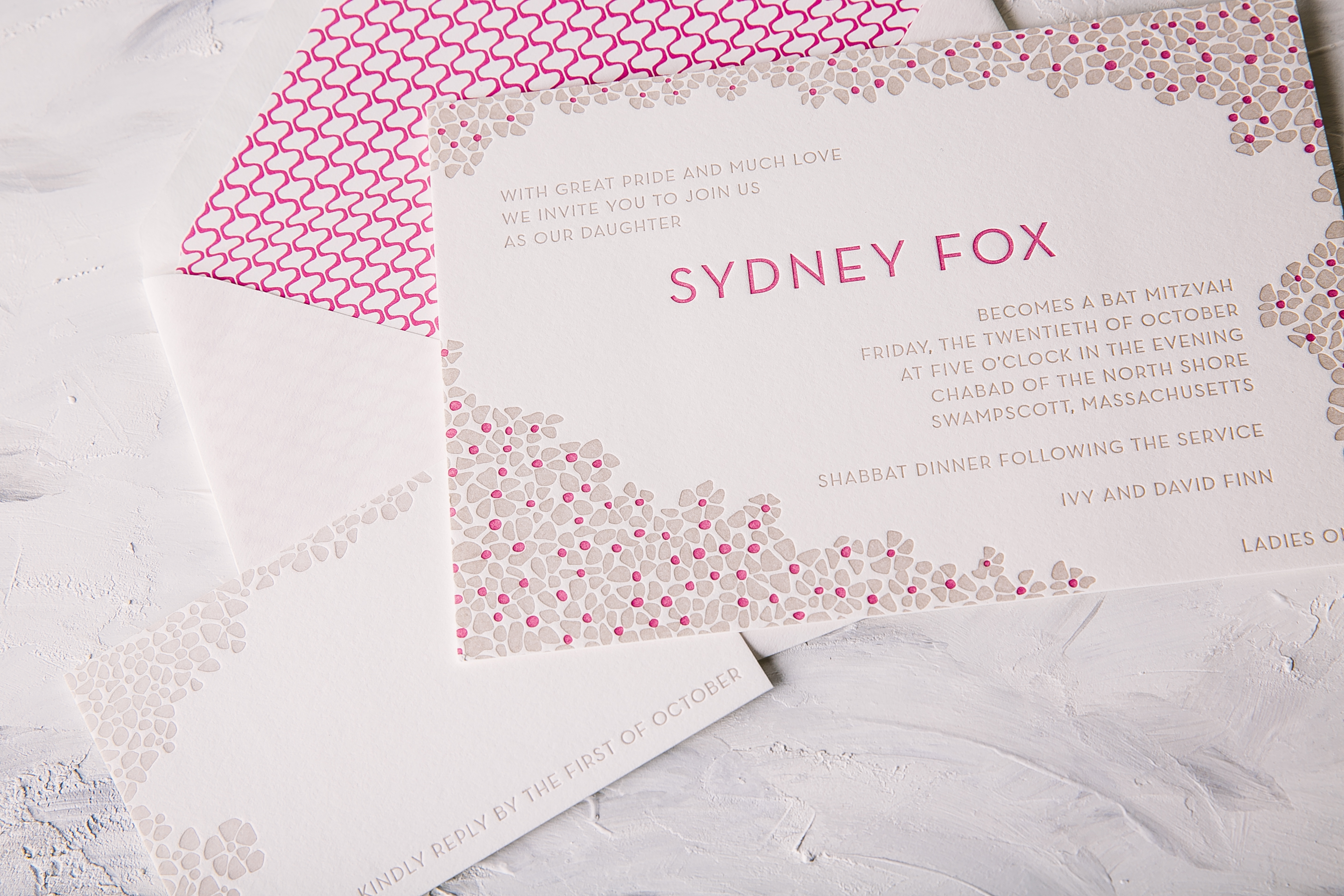
Letterpress ink colors: Hot Pink + Jute | Fonts: Lawrence | Design: Keira | Paper: 2 ply Smooth Cotton | Size: S-8 | Liner: Finn pattern in Hot Pink | Customization: 40007 | No Regrets – MA
Meresa and Eric got married this past December at the Omni Amelia Island Plantation. These polished foil stamped wedding invitations beautifully reflect their resort in Amelia Island, Florida. The invitation was printed in our Navy letterpress color and Gold Mate foil stamping accents on our gray paper, a color combination that creates an elegant overall aesthetic. The color palette was also carried onto the insert cards as well as onto the belly-band which featured a monogram in honor of Meresa and Eric. Throughout the suite, little botanical elements were added throughout the suite to add a romantic touch to this formal suite. The gold matte envelope liner tied everything together effortlessly with the help of Creative Touch.


Foil stamping color: Gold Matte | Letterpress ink color: Navy | Fonts: Gothic + Plaza | Design: Custom Library | Paper: 2 ply gray | Size: S-8 | Customization: 40463 | Creative Touch
Thanks to the help of our friends at the Papery of Philadelphia, we were able to create these darling watercolor baby shower invitations for Megan. Our Vista design has never looked sweeter with the addition of little star motifs and a die-cut shape added to create a more youthful feel. The wording popped off the page in our Platinum Shine foil with a soft, subtle watercolor background behind it. With a nod to Doctor Seuss written across the top of the page and a map of the world as the envelope liner, it’s easy to see that everyone wishes a big, bright future for this little boy to come!

 Foil stamping color: Platinum Shine | Digital ink color: CMYK Process | Fonts: Durham + Darby Filled | Design: Vista | Paper: 1 ply bamboo | Size: S-8 Chesapeake | Customization: 37676 | Papery of Philadelphia
We can’t imagine a better fit for a wedding in Cape Neddick, Maine than the design chosen for Allyson and Charles. These nautical foil stamped wedding invitations set the tone for their wedding at The Cliff House, a beautiful venue with breathtaking views of the sea from every angle. It’s only appropriate that the invitation was printed in Midnight letterpress as a nod towards the nautical affair, while accents of Rose Gold Shine gave the invitation an extra touch of elegance. The Plymouth die-cut shape added some extra interest to the design as well. A custom map pattern of the surrounding area was supplied for the lining of the envelope printed in Midnight to coordinate with the rest of the suite while little touches of seafaring motifs were included within the set in a tasteful way as well. The rehearsal dinner invitation was printed digitally in our Sangria ink color which added an unexpected but eye-catching twist to the invitation suite. We always look forward to working with Gus and Ruby on all their gorgeous invitation suites and this set was certainly no exception to that!


Letterpress ink color: Midnight| Foil stamping color: Rose Gold Shine | Digital ink color: Sangria | Fonts: Smock Ruby + Bell MT | Design: Custom Library | Paper: 2 ply bamboo, 1 ply bamboo | Size: S-8 | Customization: 39478 | Gus and Ruby
This past October Jori and Christopher were married at Architectural Artifacts in Chicago. Their venue is filled with a combination of formal yet vintage touches throughout and their refined letterpress wedding invitations reflected the space perfectly. Our Bristen design originally uses Sand letterpress only on the leaf motif, but this couple decided to change it up by throwing Taupe and Tawny Matte accents within the mix as well. To give the traditional invitation layout a little something extra, Tawny Matte was also added to the names of the bride and groom to make them shine among the rest. Guests will find the same leaf motif added throughout the rest of the set to keep everything cohesive and interesting to the eye. Thanks to the help of Quintessence Fine Papers and Gifts, we were able to create an incredibly sweet suite.


Letterpress ink colors: Sand + Taupe | Foil stamping color: Tawny Matte | Fonts: Smock Ruby + Woodland | Design: Bristen | Paper: 2 ply bamboo | Size: S-8 | Customization: 39441 | Quintessence Fine Papers and Gifts
We can never get enough of patterns that have something to say. Kelly and Ben put their own flair on our Flynn design to announce their engagement to their friends and family this part October. These modern rose gold foil stamped engagement invitations are truly eye catching with bold geometric patterns framing the page. A corresponding foil envelope liner pushed the envelope even further with a varying pattern that still complimented the invitation design effortlessly. This show-stopper couldn’t have come together without the help of our friends at Events and we can hardly wait to see what their wedding invitation suite will look like to come!
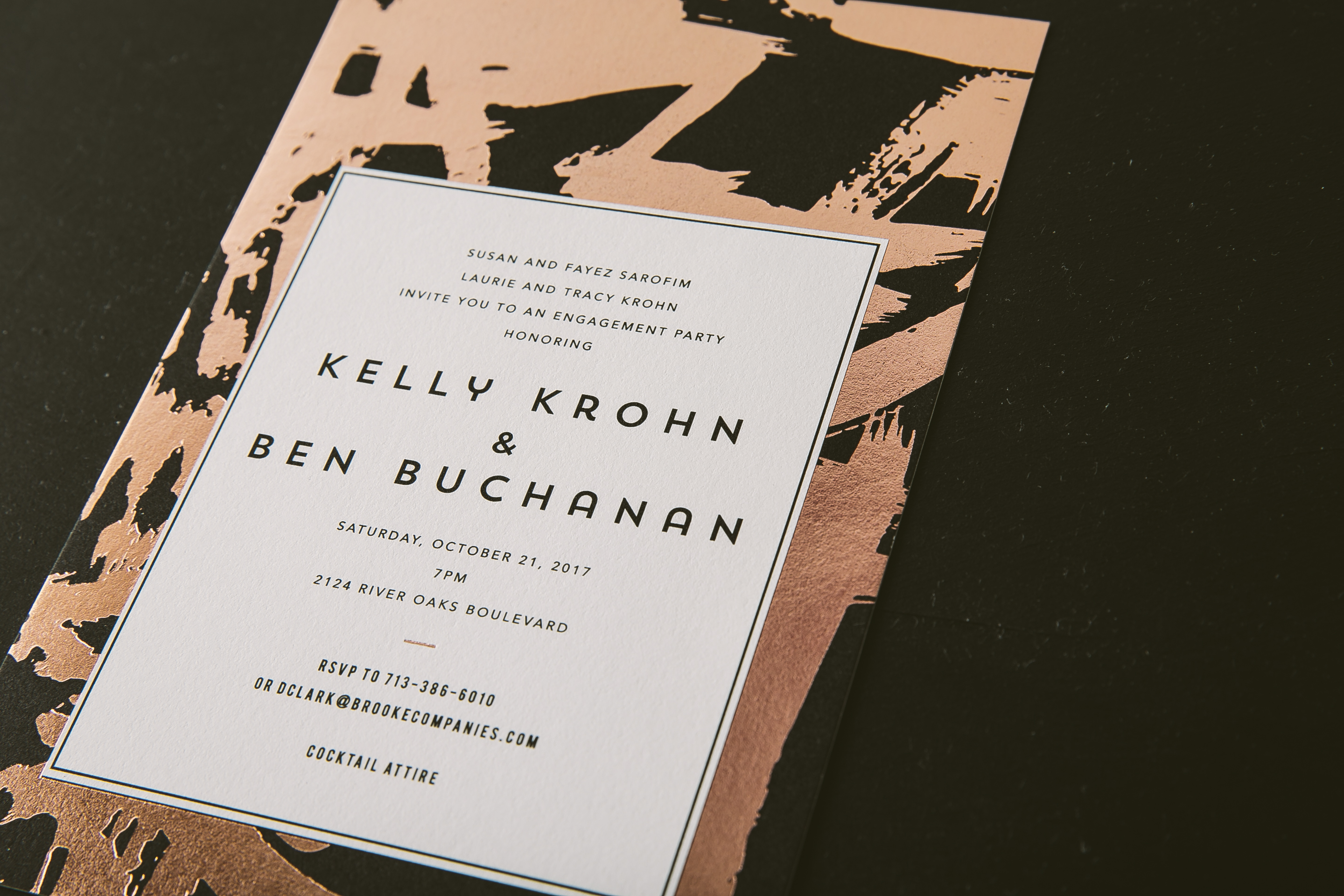

Foil stamping color: Rose Gold Shine | Digital colors: Black | Fonts: Moderno, Woodland + Barber | Design: Flynn | Paper: 2 ply smooth cotton | Size: S-8 | Customization: 40178 | Events
We worked with Sweet Paper to create these letterpress save the date booklets for Allie and David based on our Prescott design. They decided to use our Pool letterpress ink color for their wording which mimicked the serene ocean color in the photo chosen for the front page of their grommeted piece. The third page of the booklet even contains a list of accommodations to ensure that their guests book ahead of time to avoid booking during busy season in Charlottesville. We have no doubt Allie and David’s wedding will come together just as sweetly as their save the date!
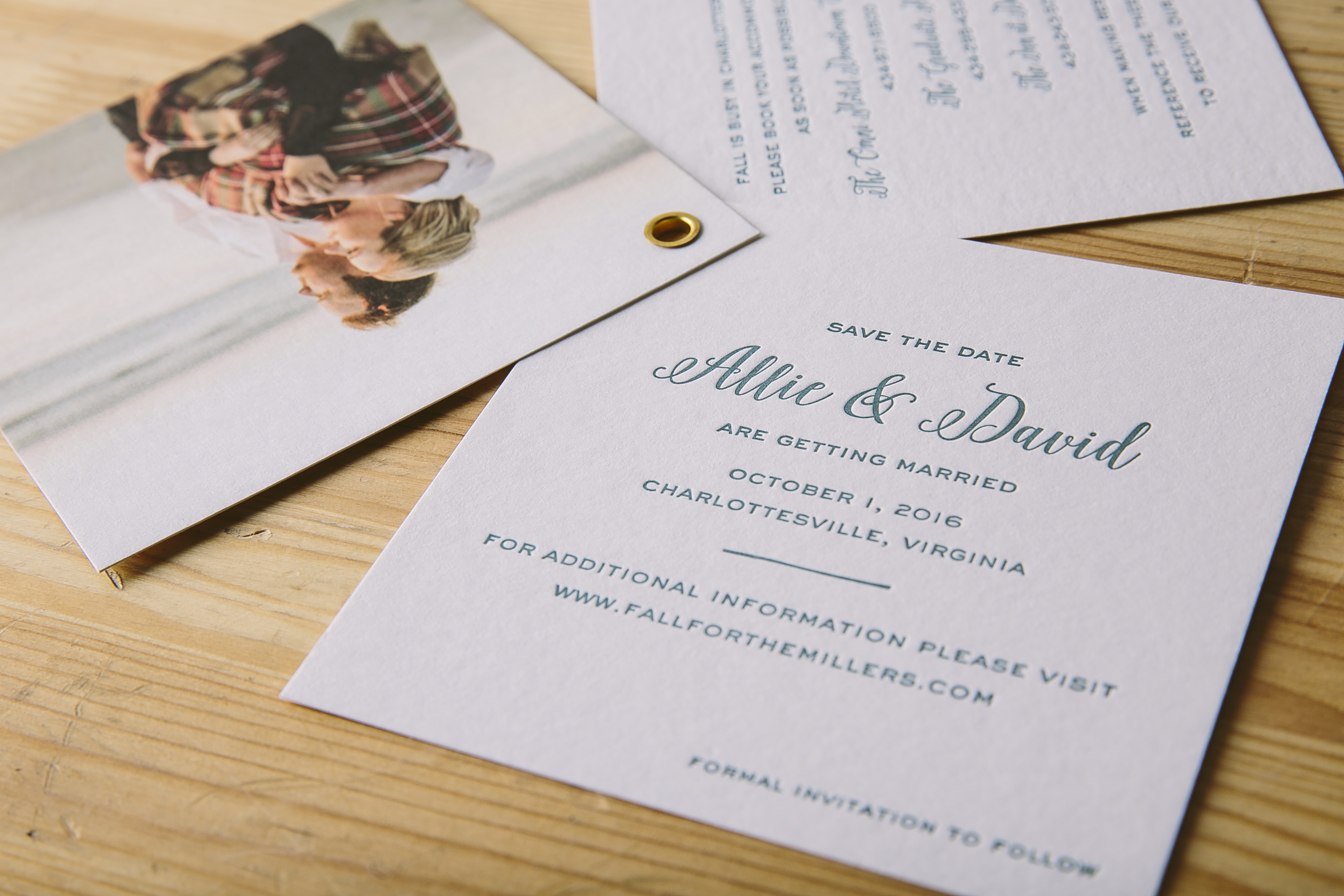

Letterpress ink colors: Pool | Digital colors: CMYK | Fonts: Gothic + Eden | Design: Prescott | Paper: 1 ply white bamboo | Size: S-5SQ | Customization: 31771 | Sweet Paper